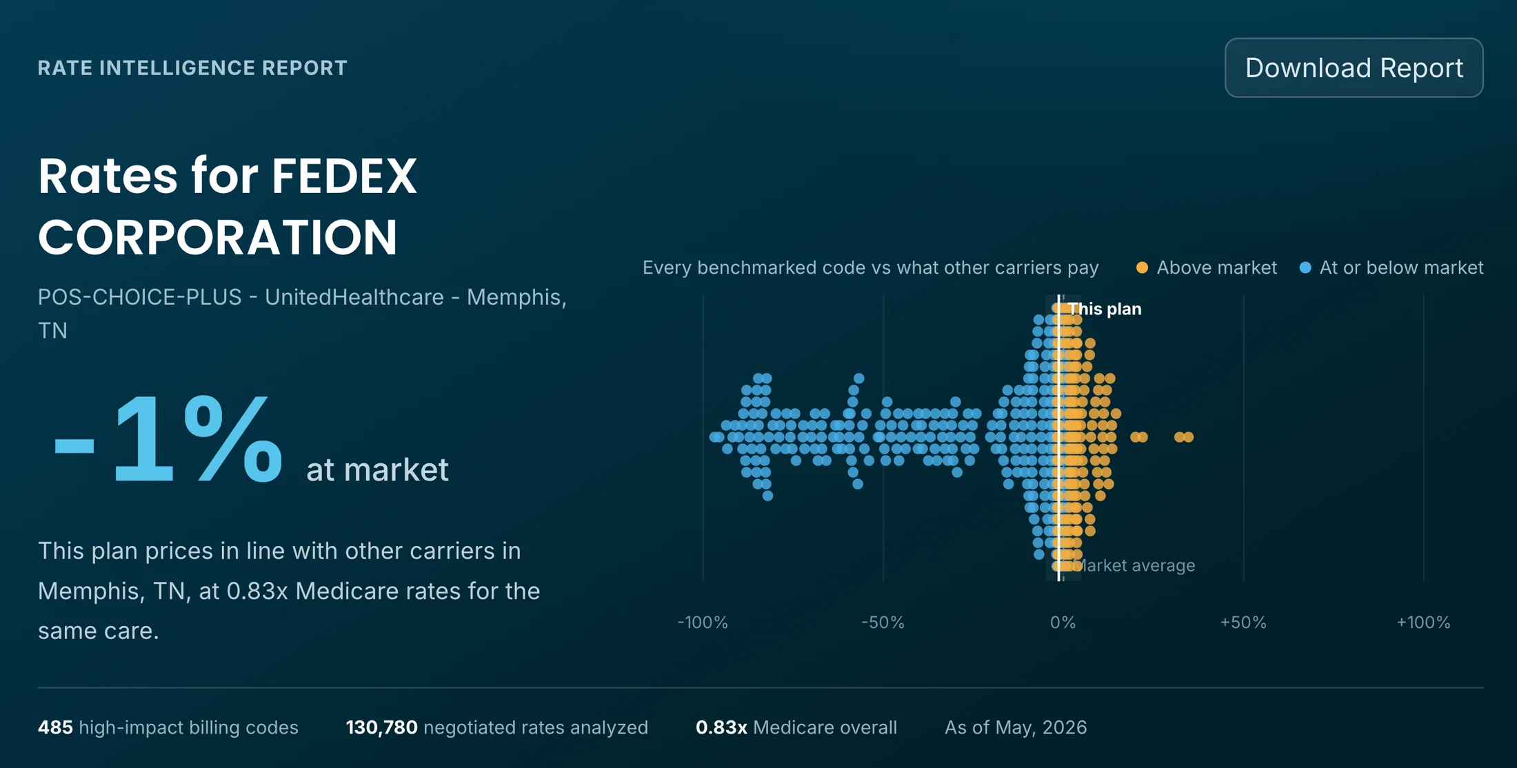
A self-funded plan in Memphis pays 0.83x Medicare for a panel of common services. A plan in Seattle pays 1.75x Medicare for the same kinds of care. Both plans price within one percent of their local market, and both could fairly be told their network is competitive.
Neither employer had a practical way to see this until now. Not because the data was secret, but because nobody had made it readable.
The data that was always there
Under the federal Transparency in Coverage rule, every health plan’s negotiated in-network rates are published in machine-readable files. That includes the rates a third-party administrator negotiates on behalf of a self-funded employer, for every in-network provider, by billing code. Enforcement began July 1, 2022, and the files refresh monthly.
The responsibility for this disclosure sits with the plan. A self-funded employer can delegate the posting to its administrator, and nearly all of them do, but the compliance obligation stays with the plan sponsor. Penalties for noncompliance can reach $100 per day, per violation, per affected individual.
So the rates exist, they are legally required to be public, and the plan sponsor is accountable for them being posted. Yet ask a room of benefits leaders whether they have seen their own plan’s published rates, and most of them will tell you they did not know the files existed.
Why nobody looked
The honest answer is scale. The payer transparency dataset is the largest published healthcare dataset in existence, on the order of trillions of rows per quarter. Every carrier organizes its files differently. Aetna alone publishes thousands of separate files, with the actual negotiated rates scattered across them. Opening one file can exhaust a laptop’s memory before a single question gets answered.
Most organizations that process this data cherry-pick the files they think matter. Payerset has taken the opposite approach since 2022: we collect every file each payer posts, every month, and keep full snapshots in perpetuity. Individual plans, group plans, fully insured, self-insured, ACA. All of it.
That decision looked expensive at the time. It is the reason the analysis below is possible at all.
What we built
We took roughly 130,000 self-funded plan sponsors, identified their plans with the large administrators, and turned the published rates into a report anyone can read.
Each Employer Rate Intelligence report shows a plan’s overall position against the market: what the plan’s negotiated rates look like next to what other carriers pay the same providers, in the same city, for the same services. It shows the plan against Medicare. It breaks both comparisons down by service line, from maternity to imaging to specialty drugs, and plots every benchmarked billing code against the market.
The reports are free. The underlying report data is downloadable, also free. There is no registration wall and no sales call. Search for an employer at payerset.com/employer-rate-intelligence and the report is simply there.
We are not showing anyone anything that is not already on the open internet. We visualized what the law already made public, because a disclosure nobody can read is not really a disclosure.
How this was measured
Every report is computed from public sources: the Transparency in Coverage files for negotiated rates, Department of Labor Form 5500 filings for employer identity and headquarters, NPPES for provider identity, and CMS fee schedules for Medicare benchmarks.
The reports cover a fixed panel of roughly 500 high-impact billing codes drawn from national commercial utilization. Rates must pass eligibility checks before aggregation: fee-for-service arrangements, standard modifiers, valid provider NPIs. Each provider and code combination is compared against a rate-count-weighted benchmark across the major payers we process, matched to the same provider and the same service to reduce distortion from provider mix. Everything rolls up as medians, so no single outlier rate drives a headline number.
The public reports reflect the employer’s headquarters market rather than every employee location, and payer-published rates can include stale entries. The full methodology, including its limitations, is published alongside the reports. We would rather be checked than trusted.
Reading the shape of the data
The plan-level numbers cluster tightly around the market average. Minus one percent. Minus two. Plus zero. Employer after employer lands within a rounding error of “at market.”
The service lines underneath tell a different story. In one large plan’s report, emergency and urgent care runs 48.9 percent above what other carriers pay the same providers, while imaging runs below market and specialty drugs sit near 150 percent of Medicare. Another plan shows maternity deeply discounted and chronic care near 208 percent of Medicare. Big swings in both directions, netting out to almost exactly zero.
Maybe that is simply how large portfolios of rates behave. Maybe it reflects how networks get assembled, with visible discounts in the categories employers ask about and quiet markups where they do not look. The pattern is consistent enough to deserve an explanation, and we are not going to pretend we have the complete one.
This is part of why the reports are free. The people best equipped to interrogate this data, the benefits consultants, the plan auditors, the actuaries, the researchers, have never had it in usable form. Now they do.
What this means for plan sponsors
Health benefits are compensation. Under ERISA, the plan sponsor is a fiduciary of that money, held to the same standard the industry long ago accepted for retirement plans. A new wave of lawsuits against large employers, whatever the outcome of any individual case, is testing a single question: did the sponsor monitor what its plan paid?
For years, a sponsor could honestly answer that the data was unreachable. Claims data locked behind restrictive contracts and months of back and forth. Rates known only to the administrator. That answer is expiring, because the rates are public and now they are legible.
A reasonable starting checklist costs nothing:
- Look up your plan’s report and see where it lands against the market and Medicare.
- Check which service lines run above market, and by how much.
- Verify that your administrator is actually posting complete, current files for your plan, since the compliance exposure is yours.
- Bring the report to your broker and ask them to walk you through it.
The employers writing the checks have been the last to see the prices. For the first step in fixing healthcare’s asymmetry, the price of admission is now zero.
Where this is headed
Transparency cannot only serve the largest health systems and carriers. It has to reach employers large and small, providers large and small, and ultimately patients. A market needs real prices, and for the first time the real prices are visible.
The reports refresh quarterly with each data cycle. If you want to see your plan against your own claims data, or see yourself against a cohort of similar organizations, we can go deeper. But start with what is free.
Your plan’s rates are on the internet. They have been for years. Go look: payerset.com/employer-rate-intelligence